UC Irvine’s new coronavirus map shows sentiment on Twitter

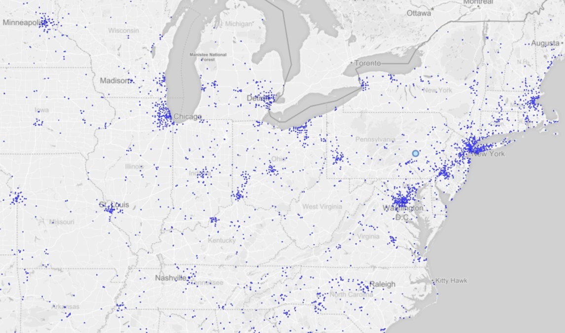
To better understand the American public’s reaction to the coronavirus pandemic, researchers at the University of California, Irvine published an interactive map this week that plots the origin of Twitter posts related to the health crisis.
A scatter plot, which is limited to the United States, is updated with each new tweet that includes terms related to the health crisis, such as “coronavirus,” “mask,” or “social distancing.” The data can be filtered by hashtag and the map includes several view modes, including scatter plot, heat map or choropleth, which allows users to view historical tweet and case counts by county, city or state bounds.
The project was led by UCI computer science professor Chen Li together with five of his students.
“This tool gives people a way to locate discussions about the coronavirus within a region and in a time window,” Li said in a press announcement. “We want the tool to help them gain insights on public discussions about this fast-evolving crisis, which can help government agencies and researchers in various domains, such as public health.”
The technology is powered by Cloudberry, a middleware system to support data visualization, and the open-source big data management system Apache AsterixDB, both projects developed by scientists at UCI.
The project received financial support from the National Institutes of Health, the National Science Foundation, the Orange County Health Care Agency, an ICS research award and the Google Cloud Platform research credits program, according to a university press release.


