School districts embrace improved Microsoft OneNote

Educators are giving a thumbs-up to the updated design to Microsoft OneNote. The latest version of the widely used app promises to create, among other things, greater consistency across devices. But for school districts already testing out OneNote’s new features — like Omaha Public Schools — that consistency is providing a “much richer experience than before,” said Rob Dickson, the district’s executive director of information management services.
The redesign makes OneNote “smoother, cleaner and more informative,” Dickson told EdScoop. Those details matter at Omaha Public Schools, which enroll about 1 in 5 of all Nebraskan students. The district — with 52,000 students and 4,000 teachers across 87 schools — requires a smart, streamlined digital experience to make the technology worthwhile, Dickson said.
OPS has been using OneNote since October 2014, but with the recent changes — announced last month and available now — the collaborative note-taking program has improved dramatically, he said.
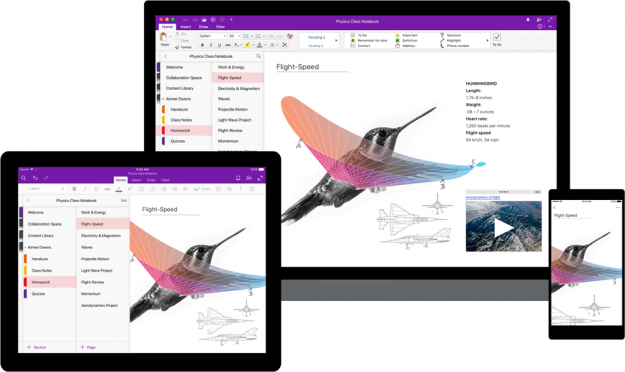
The updated design applies to Windows 10, Mac, iOS, Android and OneNote Online. It provides enhanced usability and accessibility for those who require assistance with technology, simpler navigation controls and a cohesive experience across all screens and devices. The ability to transition seamlessly between screens is seen to benefit students and teachers who alternate between their school-supplied devices and their personal devices at home.
“OneNote doesn’t just live in that 40-minute [class] period” now that users can make a fluid transition between mobile devices, tablets, laptops and desktop computers, Dickenson said. “Students will notice teachers are much more engaged after hours.”
“The biggest change for me is on my mobile device,” Dickson said. “It’s a cleaner interface.” As he — and most technology users — rely more and more on their mobile phones for communication and information exchange, a high quality mobile experience has become paramount.
“I spend a lot more time on mobile than any other device,” Dickson said. “[If the mobile experience is good], I can be much more efficient as a user and much more thoughtful on my input.”
The enhanced interface is not limited to mobile, however. Students and teachers at Appleby College in Ontario — many of whom use personal laptops and tablets on their work after hours — have noticed improvements on those devices as well.
“Things are brighter, clearer, the ‘inking’ is much improved,” said Calvin Armstrong, who serves as a liaison between teachers and IT specialists at the Canadian school.
Appleby College, a 7th to 12th grade school with about 750 students, has used some version of OneNote since 2004. Every student and teacher in the school was using OneNote by 2012.
So in February, Microsoft officials reached out and asked that Appleby test out the redesign. They’ve been in a trial period for the last few months, offering consistent feedback and suggestions to the Microsoft OneNote team.
“It has evolved tremendously since the moment they first shared it with us to what we’re working on today,” Armstrong told EdScoop. “We were quite honest with them three months ago that it wasn’t ready for classroom use.”
After several iterations of adjustments, it’s in much better working condition, he said. The design is elegant, and the content is laid out more intuitively.
“Visually, it just looks better,” he said. “And for people working in BYOD, myself and people working out of school, it’s now much easier for all of us to work together in a much more meaningful way.”
Navigation controls have all been moved to the left-hand side of the app, which “allows users to easily switch between their notes and dramatically improves usability with assistive technologies,” Microsoft said. The content layout has been changed to limit distractions, thereby increasing users’ focus. The update also comes with new keyboard shortcuts and an improved screen reader experience to help those with disabilities.
Even simple, seemingly mundane details of the updated design have resonated with Appleby’s OneNote users, Armstrong said. For example, students are thrilled about the new drawing tools.
“The variety and expressiveness of pens now — it seems funny, but it really does motivate the kids,” he said, referring to the wide range of colors and even glitter pens in the update. “I didn’t think it had the staying capacity it did, but students really did respond.”
Educators, too, are enjoying the updates. As a math teacher, Armstrong said he appreciates some of the intelligence built into the OneNote update, like the ability to draw an imperfect circle and have it automatically corrected into a neater, cleaner shape.
“I can’t stress enough the responsiveness of Microsoft to our requests [during the trial period],” Armstrong said. “It’s a much better program than it was three months ago.”

